StudyIQ
A mentorship layer, built into an exam platform serving millions
Designing the missing mentorship layer inside StudyIQ’s prep experience
Category
Engagement & support design
My Role
Product Designer
Team
1 PD, 1 Researcher
1 PM, 4+ engineers + more
Impact (Targeted)
Business
Projected uplift
Support
Reduction in resolution time
Channel Replaced
Scattered channels to unified
Context
Every doubt needs a person, not a queue
StudyIQ already had scale with millions of learners, live classes, a full course library. What it didn’t have was a person to reach when a doubt needed one. A doubt sent to a queue gets answered eventually, or lost. A doubt sent to a person gets resolved.

Problem Statement
Every doubt had a channel, None of them had a person
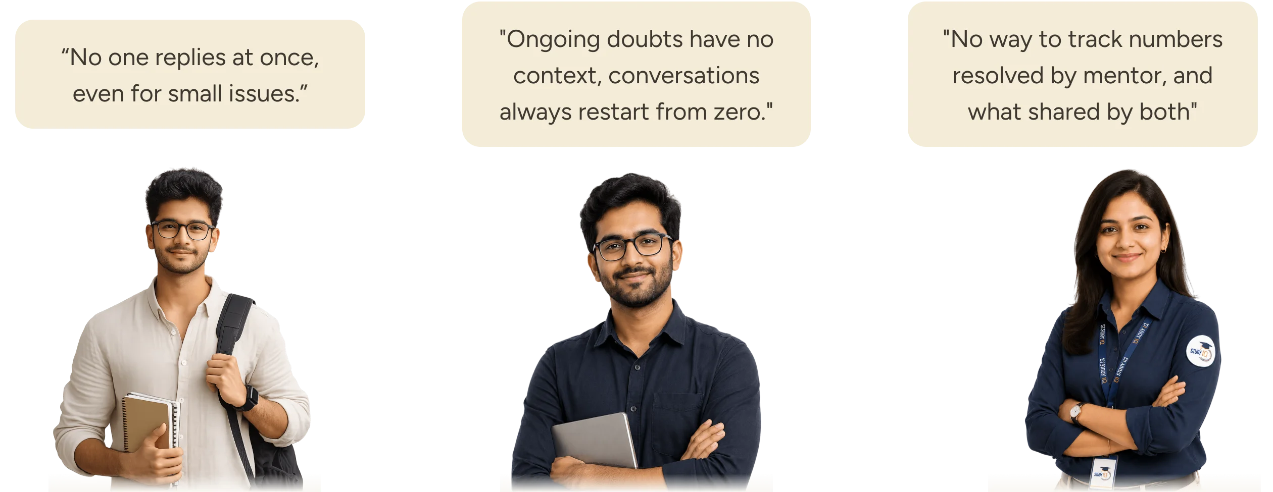
Comments piled up, nobody answered them
Aspirants posted their doubts in the comment feed and waited. Nothing trackable there to assign a mentor to actually resolve them, the questions just sat there, unanswered.
Live classes kept getting interrupted
Doubt sessions never had enough time to get through everyone’s questions. And some students weren’t comfortable asking out loud in front of the whole class, so they typed their doubts into the comments instead, right in the middle of the lecture later, pulling the teacher’s attention away from what they were teaching.
Doubts got lost inside mentor WhatsApp groups
Hundreds of messages piled into one thread. A question could get answered, buried under the next fifty messages, or simply missed, nobody could tell which.
Support tickets became a doubt-solving channel
A queue meant for billing and account issues started filling up with the doubts because there was nowhere better to ask.
Nobody could see what mentors were actually doing
There was no way to track how many questions came in, whether the answers followed the rules, how much effort a mentor was putting in, or how many doubts actually got resolved. No numbers, no record.
Constraints
The brief was fixed, The design wasn’t
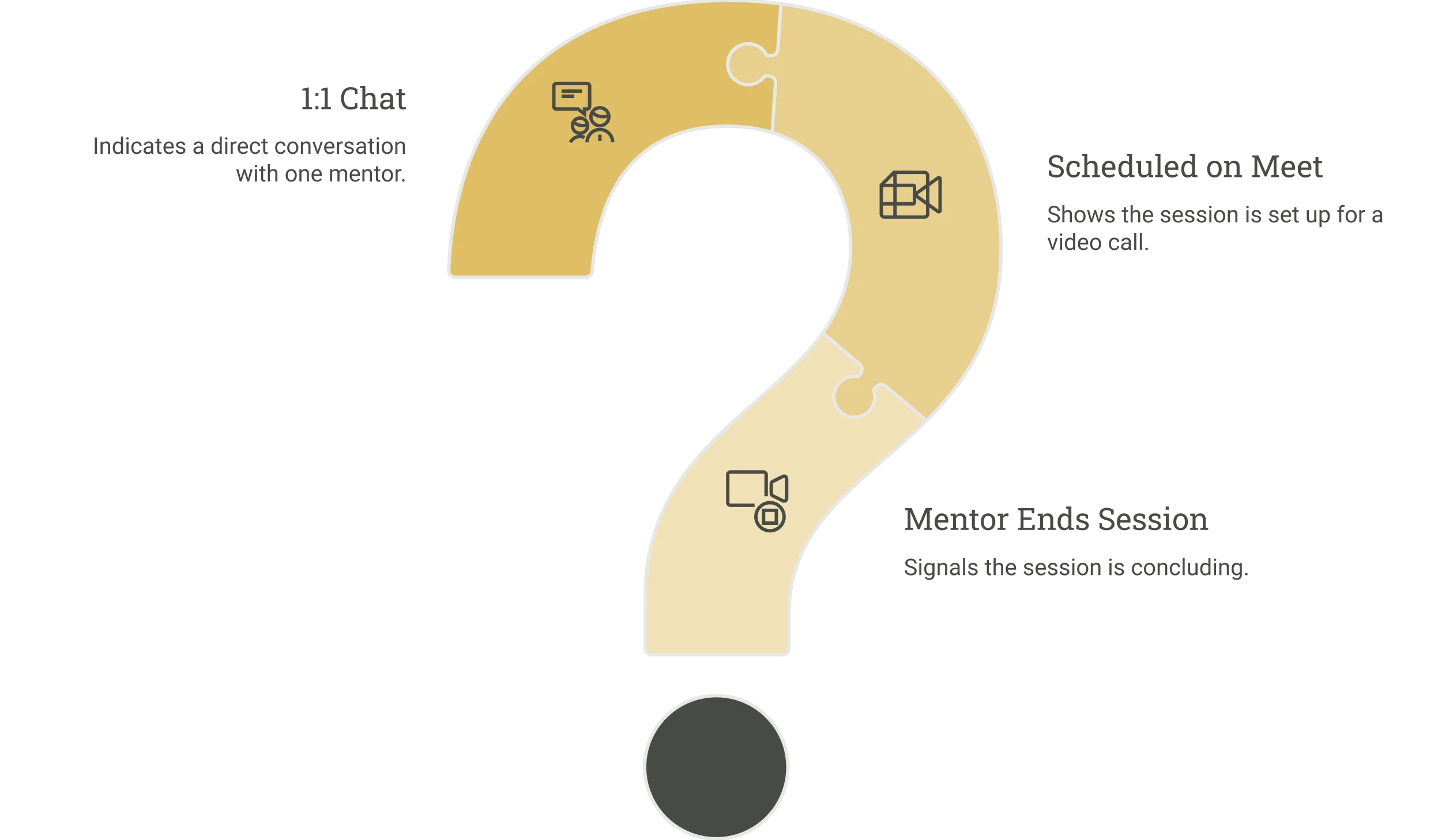
A 1:1 chat between one student and one assigned mentor
Not a group thread, not a pooled inbox, each student gets a single mentor for their course, and the chat had to be built around that one relationship, not a queue of many mentors serving many students.
Scheduled sessions on Google Meet, instant call marked coming soon
1:1 sessions had to route through Google Meet rather than a built-in call layer in version 1, booking, confirmation, and the meet link all had to work around an external tool. Instant call wasn’t ready yet, so it had to be shown honestly as coming soon, not hidden or faked.
Mentors can end a session
Ending a running session was a mentor-only action. The design had to make that asymmetry clear, a student needed to know a session was over because the mentor ended it, not wonder if something broke.
Design Decisions
Every decision, made to fit a platform already in motion
Entry point placed inside My Content
Rather than adding a new destination in the app, mentorship opens from inside the course a student’s already enrolled in. One mentor, tied to that course, reachable from a place they already visit daily.
Mentor status shown honestly, not optimistically
Online, active, or offline. The status had to tell the truth. A student needed to calibrate their expectation of a reply, not assume a mentor was always one message away.
Ending a session is visible, not silent
When a mentor closes a chat, the thread shows it plainly, a clear “session ended” state, so a student never wonders whether they’ve been left on read or the conversation genuinely wrapped up.
Feedback required, not optional
Asking for feedback immediately after a session, before the next one could start, made it a natural part of the flow instead of an afterthought nobody returns to complete.

The Experience
Every screen with continuous thread
Discovery, booking, the conversation itself, and the moment it ends, nothing here lives on a separate page pretending to be a separate feature. It’s one thread, start to close.
Starting a chat with mentor
A student opens their course, taps the chat icon, and lands on their mentor’s profile, one tap into “Start Chatting” opens a live thread, with Instant Call clearly marked coming soon so nothing is oversold. Tapping the mentor’s name or photo inside the chat opens their profile again, the same WhatsApp-style pattern students already know and scheduling a call isn’t limited to the profile screen either, the option sits right in the chat’s top bar too, so booking never means backing out of a conversation.
Booking a 1:1 call
A student schedules time against their credit balance, picks a date and slot, tags a reason for the call, writes a note, and confirms. A booking summary shows exactly what they asked for before it’s submitted, and a success screen confirms the mentor, date, and time.
Ending a session, honestly
When a mentor closes the chat, the thread marks itself “Session Ended” and asks for a quick rating before anything else can happen. If a student messages again anyway, they’re capped at 3 messages before a snackbar steps in, a soft limit that keeps a mentor from returning to a wall of unread texts, without shutting the student out entirely.
Future Scope
The next layer
Instant Call for urgent doubts.
Quick-call access for time-sensitive doubts, so students don’t have to wait for a scheduled slot when the question can’t sit until then.
Embedded video calling.
Calls that happen inside the app itself, removing the redirect to Google Meet and closing the one gap between chat and conversation.
Rich attachments in chat.
Support for images, audio, and PDFs, so a doubt can be shown, not just described, cutting down the back-and-forth needed to explain it in words.
Auto-timeout for idle chats.
Sessions that go quiet get closed automatically, keeping both sides working within a structured window instead of an open-ended thread nobody formally ends.
Built-in credits and payments.
A native payment and recharge layer, so booking a session doesn’t depend on credits managed somewhere else in the platform.

Development
The Handoff
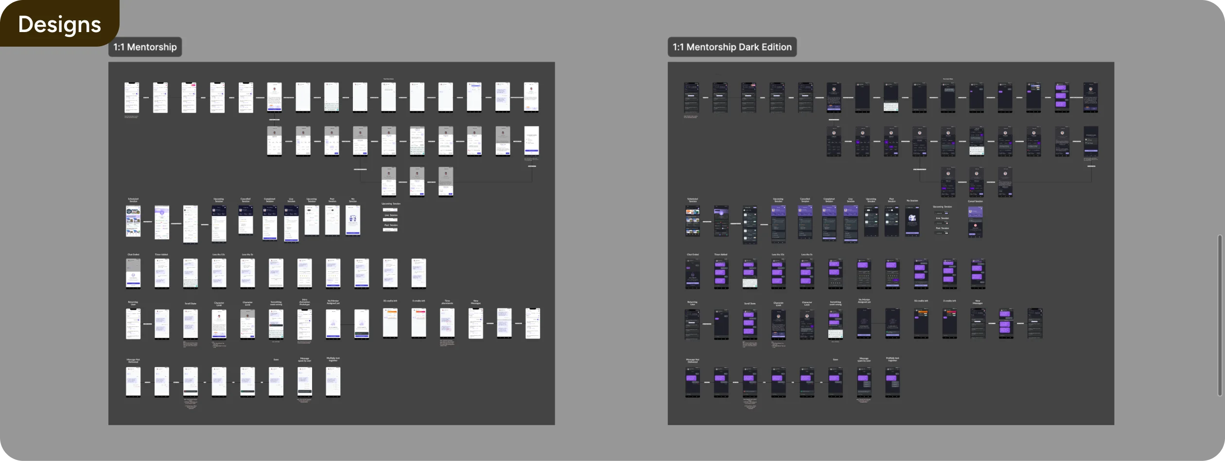
Here’s how we shipped & verified it with the development team.
Next Case Study
Learnr→
Paid Users
App Rating