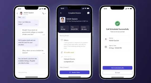
Learnr
Making exam prep a habit, not a decision
Building Learnr’s trust-first loop a 0→1 short-form learning product that turned hesitant aspirants into paying users
Team
3 Product Designers
1 User Researcher
2 Product Manager
8 Engineers
Impact
Activation
Onboarding completion
Engagement
Watched beyond 8 mins
Conversion
Users converted to paid
Context
Exam prep sells commitment before it earns trust
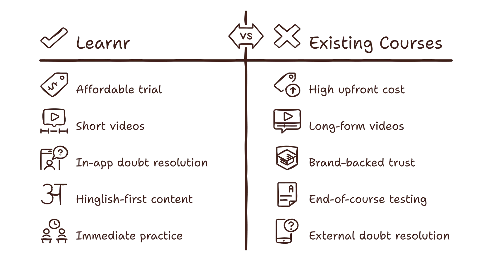
Adda Education’s other products were built the traditional way where users have to pay the full course fee upfront, commit before you’ve watched a single lesson. Learnr was built to be the opposite. A 0→1 product, in Hinglish from day one so language was never a barrier to entry, made of bite-sized videos.
Every video came with its own quiz, so an aspirant could test whether a concept had actually learned well, right after learning it. A chatbot sat alongside the content, ready to help with a doubt on any generics topic, any video or quiz, or simply to practice English, the kind of everyday support an aspirant could otherwise only get from a tutor. And instead of the all-or-nothing course fee, Learnr ran on a subscription: aspirants could experience the product first and decide to pay only once they’d felt it working.
The bigger shift was where Learnr competed. It wasn’t built to be chosen over another exam-prep app, it was built to replace the minutes an aspirant would otherwise spend scrolling social media, offering the same low-commitment, always-something-new feeling, without asking for anything in return.
Problem Statement
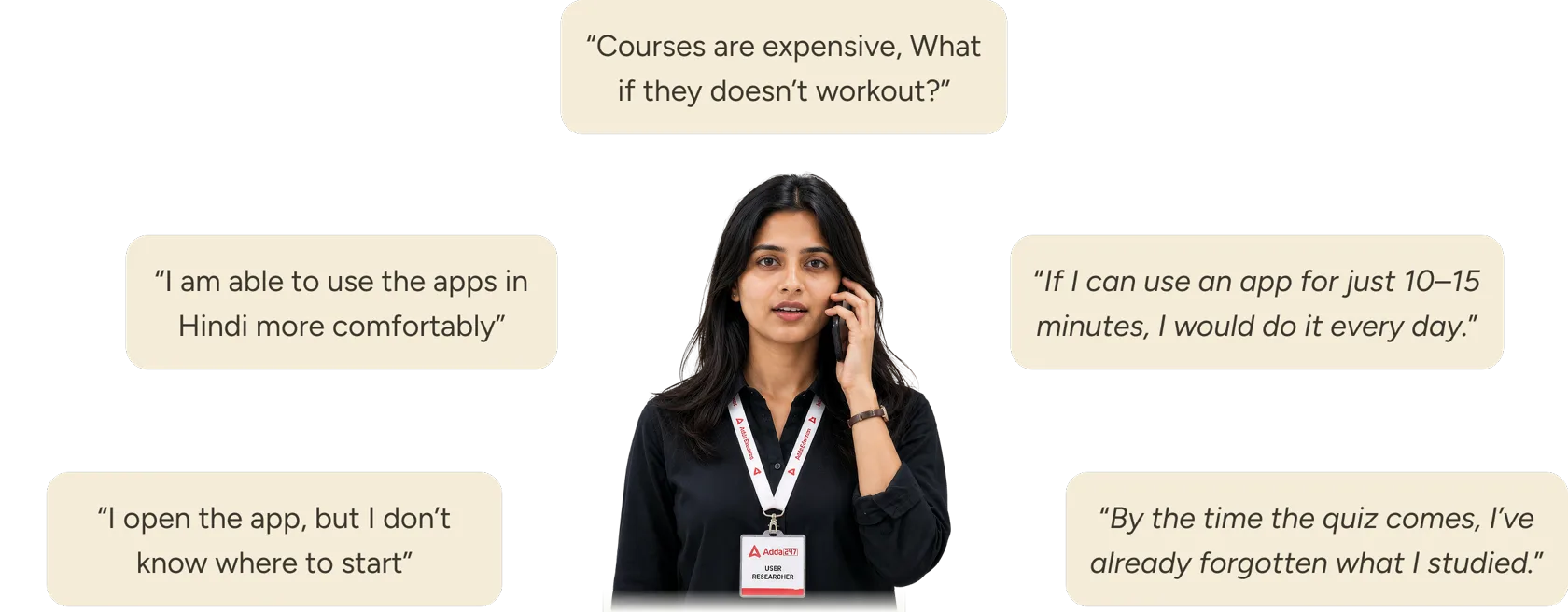
Every step asked for trust before it was earned
Pay first, learn later
A large fee was charged before aspirants could feel whether the product was worth it, the first friction the whole product had to solve.
Long lessons, small concepts
A single idea sat buried inside a long lesson, costing hours to learn something that needed minutes.
The quiz came too late
Practice arrived after a stretch of videos, so concepts had already faded by the time aspirants could test themselves.
Nowhere to ask, in the moment
A doubt mid-lesson had no path to resolution inside the app, so aspirants left to search, and once gone, many didn't return.
Constraints
The brief was fixed. The design wasn’t
A homepage with stories, trending and subject-wise entry
Three discovery patterns, all required on one home surface, the design problem was hierarchy: which one greets a first-time aspirant vs. a returning one, without the homepage becoming a bazaar.
Short videos, organised into modules
Bite-sized content was mandated, but so was structure, every video had to belong to a module, and the experience had to stay engaging, not become a folder of clips.
A quiz on every video
Practice couldn't be a separate mode or an end-of-chapter test. Each video needed its own quiz, the open question was timing, weight, and how to keep it from feeling like homework.
An AI chat assistant
Aspirants had to be able to chat with an AI bot. Whether it lived in its own tab or inside the learning flow was ours to figure out, and became one of the highest-leverage decisions in the project.
Hinglish as the platform language
The product had to be built vernacular-core for Tier 3–4 aspirants from day one, which shaped content, UI copy, and Riya's responses before a single screen existed.
Design Decisions
Every screen with a decision
A vertical scroll, YouTube Shorts–style
Video, description, play/pause, like, and share sit exactly where a Shorts or Reels viewer already expects them. Nothing about consuming a Learnr video needed to be learned, the only new thing was the content underneath it.
Stories, borrowed from Instagram
Stories are how aspirants already expect to hear “what's new” in short form: a quick, skippable preview rather than a full session. Borrowing that pattern let new modules get noticed without competing for feed real estate.
Home divided by category
Home is split into rows by category the way a streaming home screen is “trending, subjects, history” because aspirants already know how to scan a shelf of options and pick one, rather than parse a single continuous feed.
Riya, placed inside the video and the quiz
A doubt happens the moment a concept doesn't land, mid-video or mid-question, not later, and not in a separate tab. Riya sits exactly where the doubt appears.
Structured modules
Each module groups its chapter's videos and quiz questions with the progress and sequence. A visible content and attempted count tracks exactly how far into the chapter an aspirant has gotten, giving bite-sized content a sense of “next” without forcing anyone through a rigid, locked path.
Shipped Versions
Shipped, measured, rebuilt
Learnr shipped in multiple versions, and none of them were visual passes. Each version rethought how the product worked, what a session looked like, how aspirants moved between videos, quizzes, and doubts, and what greeted them when they opened the app. The five mandates stayed fixed throughout; everything about how they fit together was rebuilt each time, triggered by what real usage showed us, not by a redesign itch. Here’s the key versions, what we believed when we shipped it, and what the data told us next.
V1 – Course-first, manual, generic
We bet that structuring everything around a chosen exam, course pitch, batch selection, then content, was the fastest way to make Learnr feel credible. Personalisation and AI support didn't exist yet.
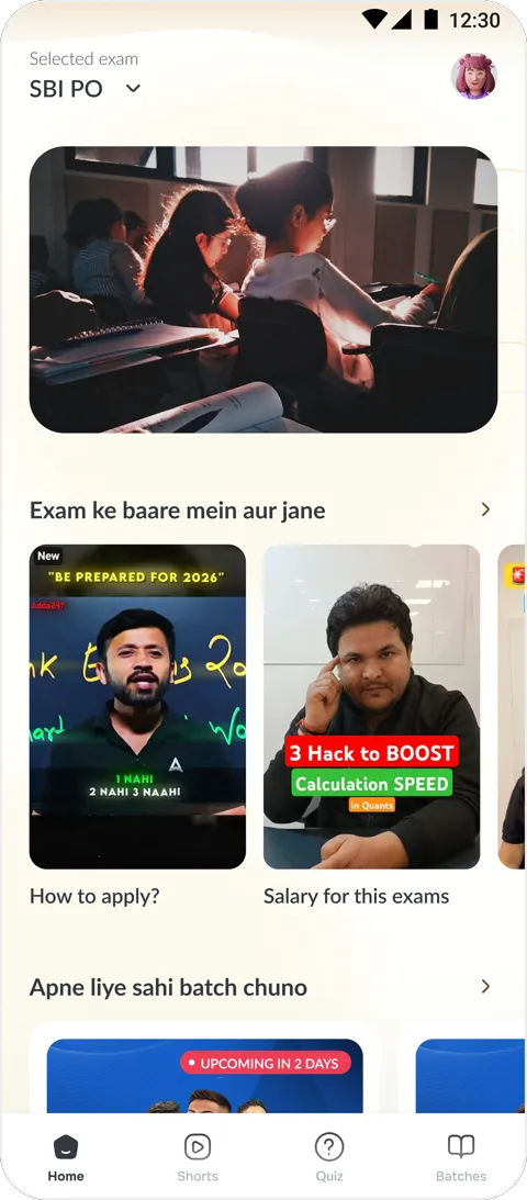
Home
Course-pitch video on top → best batches for that course → a course-related video → one quiz question → filler content (job alerts, current affairs).

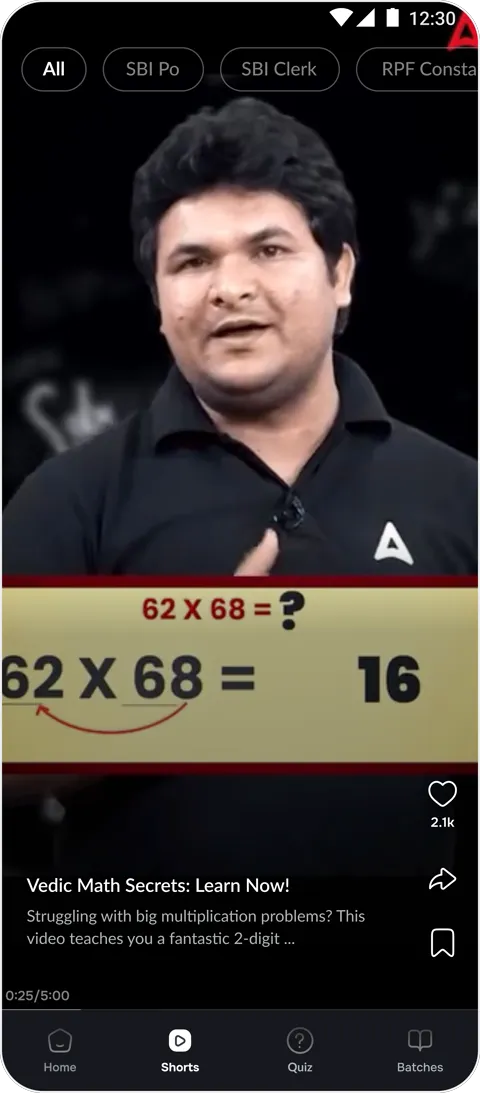
Feed
Filter on top by role/category, each video has title, description, like/share/bookmark/pause/forward options.
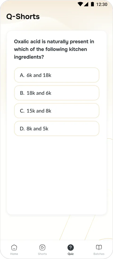
Quiz
Separate tab, generic UI matching the rest of the app, each quiz upon the seen video.
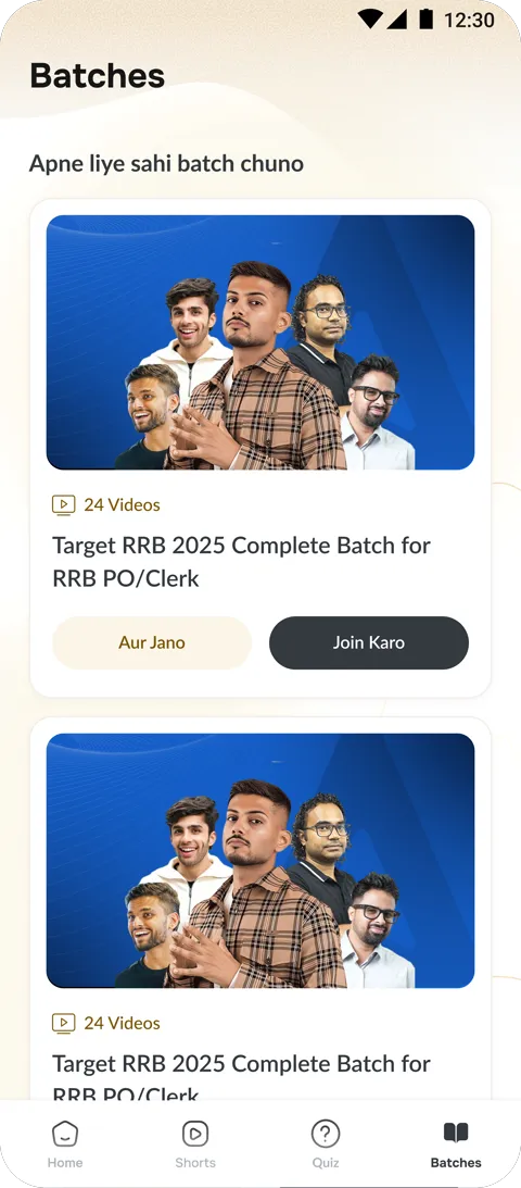
Batches
Manual: pick a batch → check details → join → travel into the batch to find topic videos.
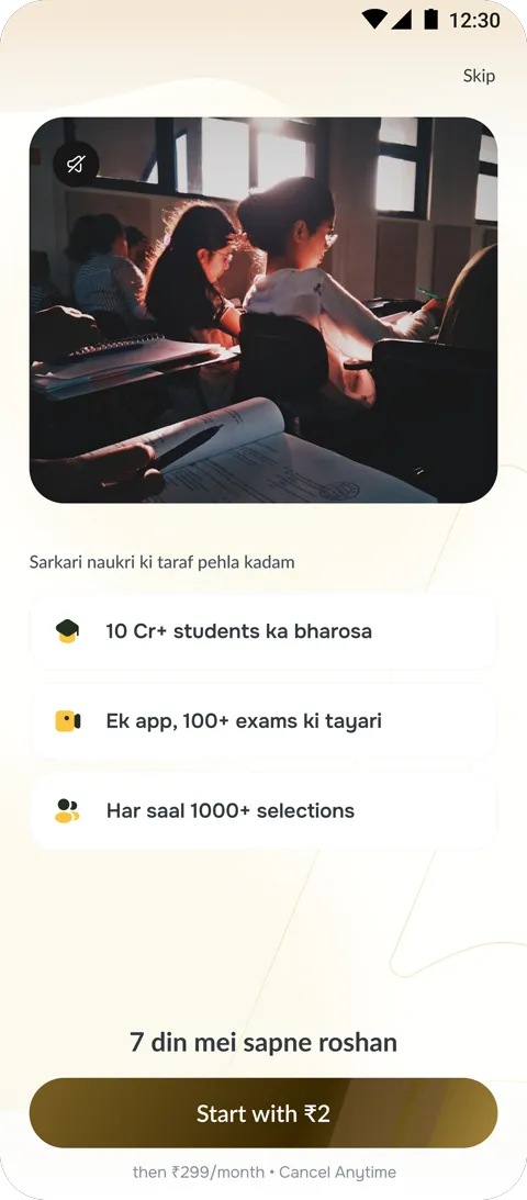
Paywall
Famous-teacher video pitching the product, product key features below, price for X days shown upfront.
V2 – Personalised, AI enters, quiz moves into the feed
We bet that removing manual batch selection and introducing an AI doubt-solver would deepen engagement, and that practice belonged inside the scroll, not off in a separate tab.
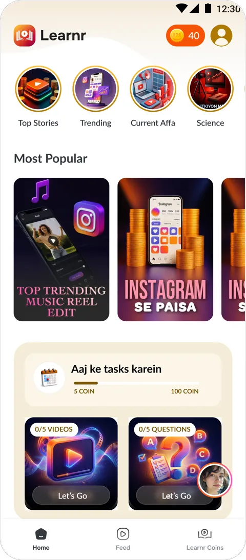
Home
Stories added on top, a task section for earning free tokens, subject-wise filtering, top-10 trending, AI-related videos, key personalised subject videos, floating Riya entry point — Riya introduced this version.
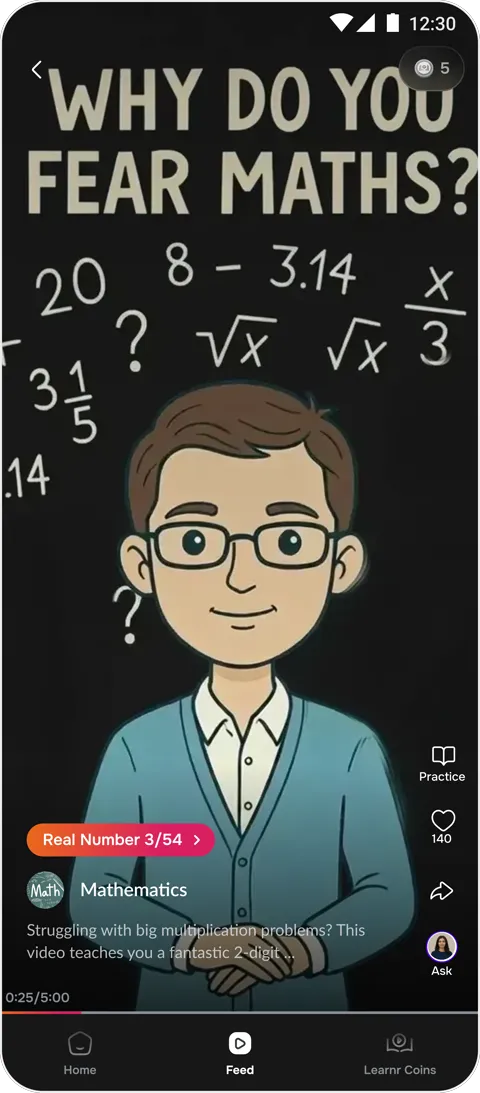
Feed
Videos personalised to onboarding choice, entry point lands on the batch page, Ask-Riya entry point added on video, each with share/like/ask, tapping “Practice” on a video surfaces its own question set.
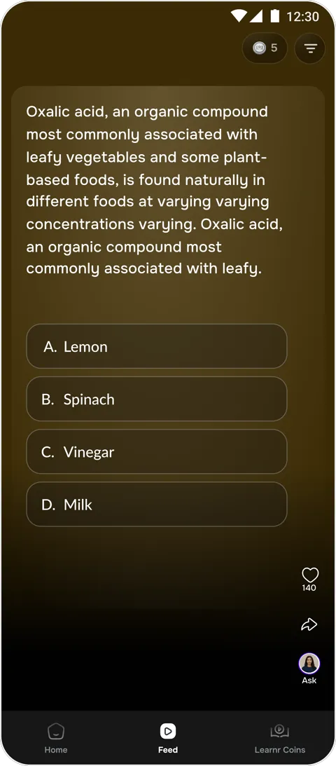
Quiz
Gamified redesign, Ask added, placed quiz into mid-scroll (3 videos → 3 questions).
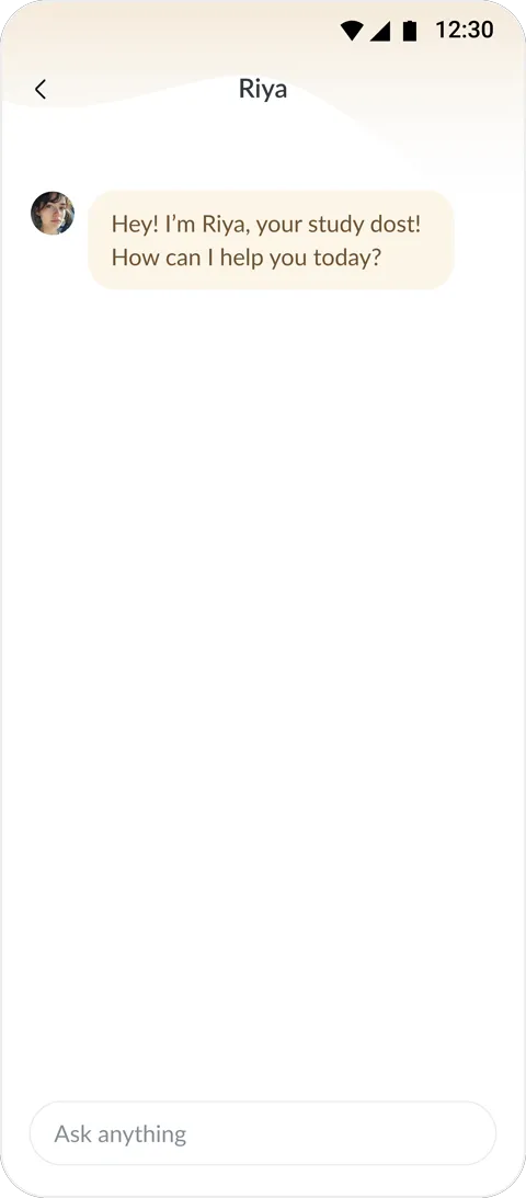
Riya
Reactive only, ask a doubt on a specific video or quiz or a batch related queries.
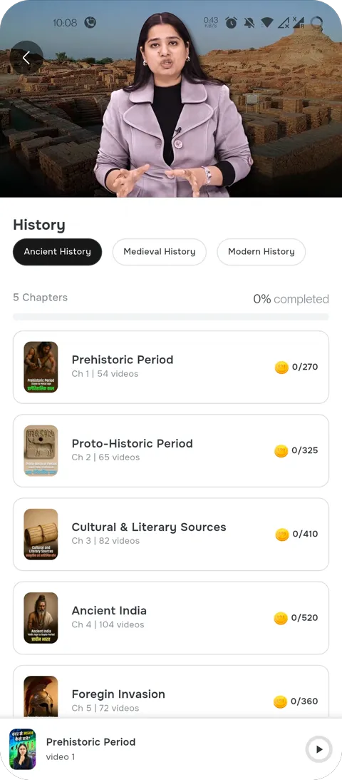
Batches
Entry point inside video/home routes to the personalised batch from onboarding choice, no manual joining.
Where Landed
Learnt and Landed
Learnr isn’t paused here, this is what’s shipped, while the team keeps building on top of it. Five surfaces, each carrying forward what the earlier versions taught us, still open to the next change.
Home Page
By tagging content as english learning, trending, subject, or story, the system automatically routes it to the right slot template on the home feed. Whoever's updating content only needs to add the video and its category, the layout adapts on its own.
Feed
Every video, regardless of subject or exam, renders through one card template, thumbnail, title, and the like/share/ask row stay fixed regardless of content. Adding a new video means dropping in the file and tagging its subject, the card assembles itself, no manual layout work per video.
Quiz
Rather than building a custom screen per question type, quizzes run through a set of 5 MCQ templates, all containing question text, four options, and the right/wrong state. Content creators write the question and mark the correct option, the interaction and styling never need to be touched again. Quiz was shifted back to a separate entry point for better engagement and a more frictionless experience inside the feed.
Riya
Riya's three modes (doubt, generic, English-practice) sit on one chat shell rather than three separate flows. The system reads which mode the aspirant picked and adjusts the response logic and suggested prompts underneath, the interface itself never changes.
Batches
Instead of a maintainer manually assigning which batch a user lands on, the system reads the subject/exam chosen at onboarding and routes to the matching batch template directly, no manual curation needed as new batches are added.
Development
The Handoff
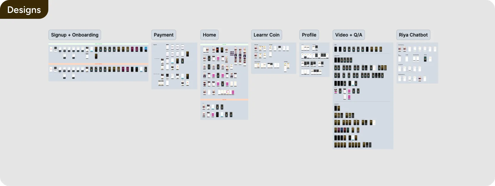
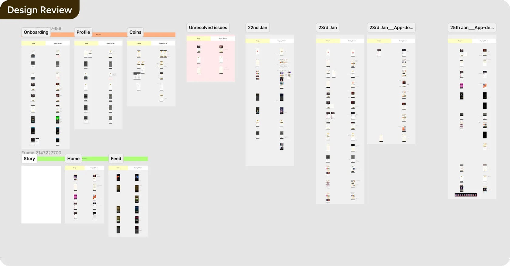
Here’s how we shipped & verified it with the development team.
Next Case Study
Mentors Buddy→
Business Uplift
Faster Support